A History of Data Visualization
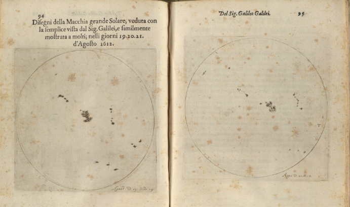
On display are illustrations that show the location, size and shape of sunspots that Galileo observed by projecting the sun onto paper through a telescope. Courtesy of Special Collections
A colorful pie chart created in 1805 by the inventor of statistical graphs, William Playfair, to show the then-proportions of the states, territories and provinces of the United States.
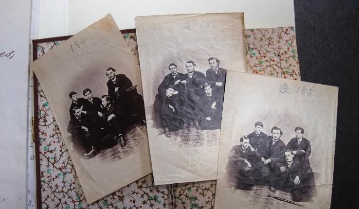
Maps and charts of Manhattan in the early 1930s prepared by the Slum Clearance Committee of New York.
Illustrations of the location, size and shape of sunspots that Galileo observed by projecting the sun onto paper through a telescope.
A map to visualize the number of prostitutes in each of Paris’s 48 quarters in the early 1800s, as famed hygienist Alexandre Jean Baptiste Parent-Duchâtelet explored the connection at the time between prostitution and public health.
These are some of the dozens of charts, graphs, maps and other images on display in Linderman Library through May 2018 as part of an exhibit titled, “At a Glance: Selected Works in the History of Data Visualization.” The items are on display in the library’s main reading room, the Café Gallery on the ground floor, and the Bayer Galleria on the third floor.
“An exhibit on data visualization history was conceived of as a way to link the past to the present and form a connection with students,” said Special Collections curator Lois Black. “By showcasing books on diverse topics, staff are able to demonstrate how historical texts become relevant to present-day scholarship.”
The exhibit began as an exploration of the history of data visualization and was expanded to include a myriad of disciplines. Represented are materials from a range of subjects, including art, literature, demographics and the physical sciences. A common element is the use of visual images to convey data, which then allows for more persuasive and compelling arguments.
“People think of Special Collections as having dusty, old books that can’t be incorporated into their curriculum,” Black said. However, the exhibit “really shows the breadth of our collection and how the material can be mined for the data they contain.”
At 4 p.m. Tuesday, March 27, the Friends of the Lehigh University Libraries sponsored a public lecture by Will Noel, associate university librarian and director of the Kislak Center for Special Collections, Rare Books and Manuscripts at the University of Pennsylvania and director of the Schoenberg Institute for Manuscript Studies.
In his talk, “Special Collections as Data: Historic Materials and their Digital Dissemination,” Noel discussed the relationship between images and the historic artifact. The lecture was held in in the Linderman Library Scheler Humanities Forum.
Black advised that those who view the exhibit consider how well the items convey meaning, as charts, graphs, maps, and other images are intended to help viewers to process information quickly and efficiently.
In selecting material for the exhibit, librarians drew upon both historical and modern sources, Black said. There were lively debates that extended to the definitions of “data” and “information.” Several of the selected items might be said to push the boundaries of data visualization, Black said, but all convey information through illustration.
Visitors will have the opportunity to see an early pie chart designed by William Playfair, the inventor of statistical graphs. The pie chart, which inspired the design for the exhibit poster, supplements the Statistical Account of the United States of America (1805) and is representative of Playfair’s contributions to information visualization.
Other highlights include The Illustrated London News Grand Panorama of the Great Exhibition of All Nations (1851), a rolled work showing two parallel vignettes of the exhibits. On display are prefatory diagrams that provide a snapshot of visitation to the important exposition.
Also on display is a copy of the second edition of Nicolaus Copernicus’s De revolutionibus orbium cœlestium, showing the author’s heliocentric model of the solar system.
The exhibition can also be accessed online.
Posted on:
Tuesday, March 27, 2018
Share This Story:


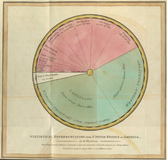
On display is a pie chart created in 1805 by William Playfair to show the then-proportions of the states, territories and provinces of the United States. Courtesy of Special Collections
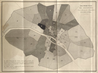
Among the items on display is a map intended to help the reader to visualize the number of prostitutes in each of Paris’s 48 quarters in the early 1800s, as famed hygienist Alexandre Jean Baptiste Parent-Duchâtelet explored the connection at the time between prostitution and public health. Courtesy of Special Collections.